Who are you? Who are you trying to reach? Without a comprehensive answer to these questions, you will be unable to design a brand identity that gets you the audience and customers you need. Read on to learn more about what it takes to craft a strong, authentic brand identity.
What Is Brand Identity?
Investopedia defines brand identity as “the visible elements of a brand, such as color, design, and logo, that identify and distinguish the brand in consumers’ minds.”
It is not the same as brand image, which is the actual result of the efforts that go into designing a brand identity, whether or not it works.
Brand identity can make or break a brand. A strong brand identity opens doors for your business: it drives interest in your products and/or services, increases engagement, and plays a significant part in growing your customer base (and increasing your revenue).
The Components of a Strong Brand Identity
Designing a brand identity that will put your business on the map takes commitment. The work involves numerous design considerations and therefore calls for a systematic approach and overall organization.
The following are what you need to establish a strong brand identity:
1. Knowledge of your brand and your target
When asked who your target customer is, can you clearly describe them? To be able to do this requires, you have to have insight into who they are: What do they think? What are their goals? What makes them tick?
Knowing your target is vital to your visual identity design—which is about how you want to be perceived, more than anything else. This also means that you have to know who you are and what your brand stands for. Only then can you establish authentic communication, with your audience, ensuring that your brand message is consistent with your vision, mission, and values.
2. A relevant, expressive logo
How do you approach your logo design? Of course, the resulting logo should be a delight to look at, but in order for your logo to work, it must echo your core brand identity, your mission, your vision. This is not an easy thing to achieve so buckle up and keep at it until you’ve struck gold.
Here are some of the most enduring, impeccably designed logos to take inspiration from:

The relatively new FedEx logo can appear very simple—until you see the forward arrow formed by the negative space between the letters e and x, quietly but firmly reinforcing what the brand is about.

The IBM logo was launced in 1972 and has remained unchanged. Called the 8-bar, it is considered by the company to be among its most valuable corporate assets.

The Coke logo evolved over 130 years, during which it has carved a place for itself among the most universally recognizable brand logos.
3. A comprehensive, consistent visual brand identity
You need to be able to communicate your brand message effectively and consistently through your visual identity. Which is why your designers need to be on the same page as you. To ensure this, provide them all the necessary tools and guidelines for creating on-brand content across different mediums.
Your team guidelines should cover the basics, including:
- Logo
- Colors
- Fonts and typography
- Hierarchy
- Photography
- Illustration
- Iconography
- Data visualization
- Interactive elements
- Web design
- Video and motion
4. Engaging, intuitive web design
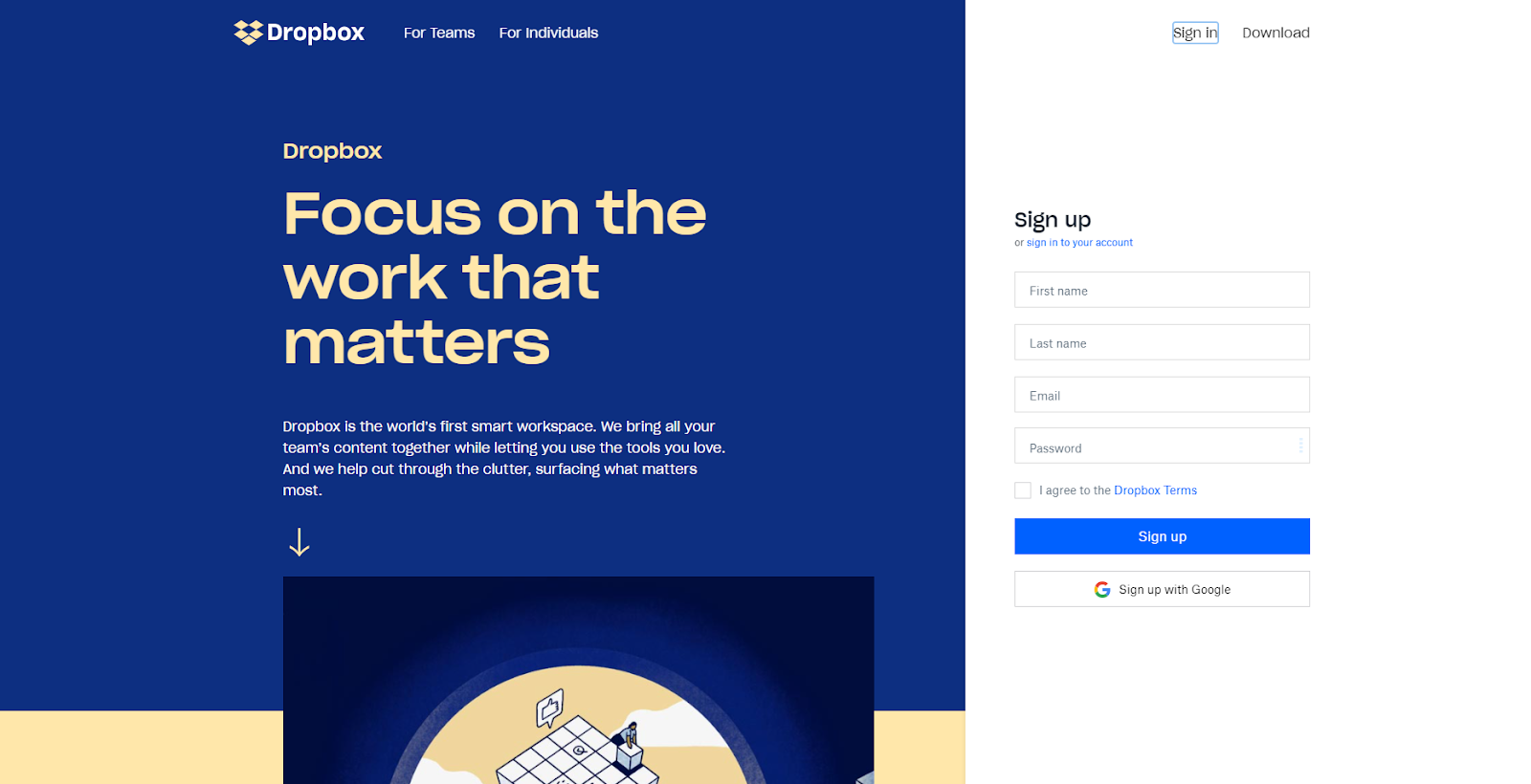
Your brand identity is represented heavily by your website, which is even truer if you’re running an online business or offering a digital product. Your website will be the first thing prospective customers will want to see and will likely be a major factor in their decision to do business with you.
Aim for intuitive design to make your brand identity come through loud and clear in your website. Mobile-responsiveness is now a must for web design, so be sure to put a premium on user experience by accommodating an increasingly huge number of website visitors using mobile phones.
Website

Mobile


5. Consistent, complementary elements
Colors, typography, high-quality images alone don’t give you a cohesive brand identity that translates into an equally cohesive brand experience for your audience. This cohesiveness requires consistent elements that complement one another.
Your logo is a great place to start: Ensure that your typeface doesn’t clash with your logo in terms of character shape and personality. Then be sure to choose colors that are out of sync with your typeface and any image in your logo.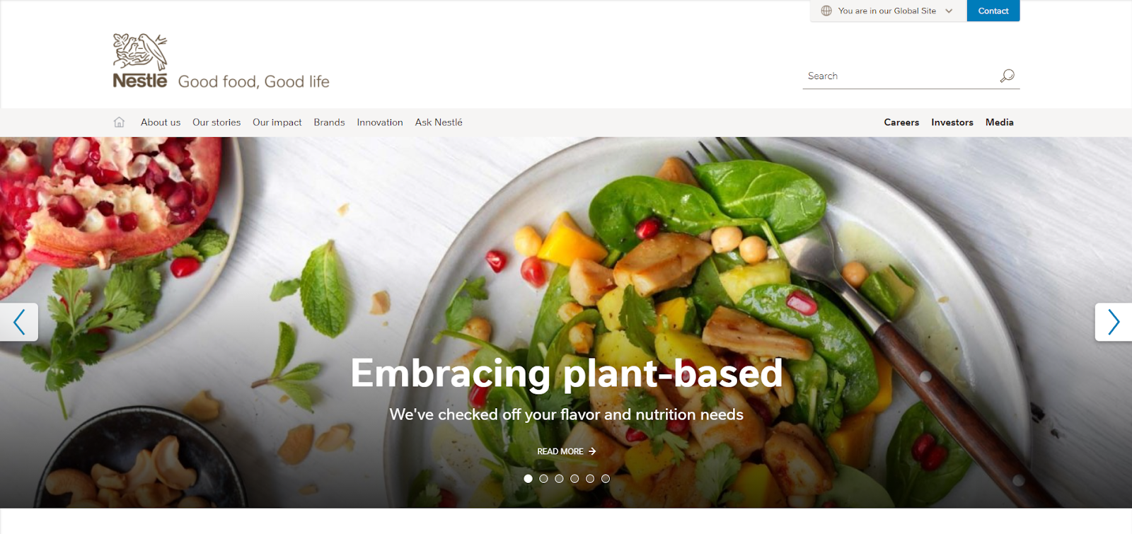
6.Seamless navigation
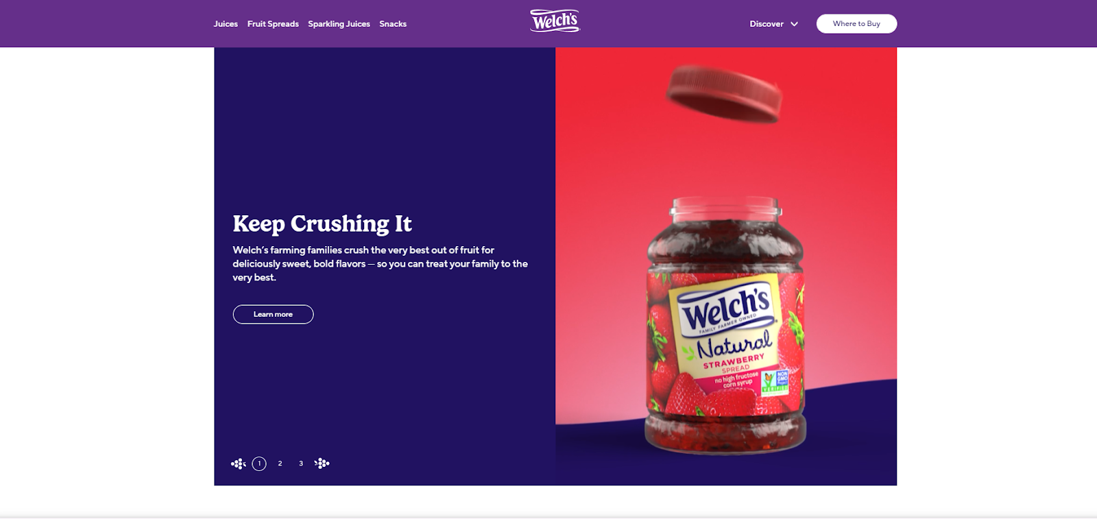
Ease of navigation in your website deserves careful consideration when designing your brand identity. Having an intuitive hierarchy in place ensures harmony and coherence, and therefore ease of navigation. Ensure that all components of your website are in the proper order: headers, subheaders, body copy, images, blurbs, etc.
7. Effective typography
Typography done right is guaranteed to enhance your brand experience. Effective typography is not too cluttered, never unreadable, and doesn’t overwhelm. When it is either or all these, it will likely turn people off.
To ensure consistent legibility, try this test recommended by lettering artist Jessica Hische: Type an uppercase I, a lowercase l, and the number 1.
8. Well-chosen colors
Yes, embrace color, but take care not to go overboard. Don’t get your brand identity be hijacked by ill-advised and poorly executed use of colors
Try to stick to this simple formula:
- 2 primary colors
- 3–5 complementary colors
- 2 accent colors
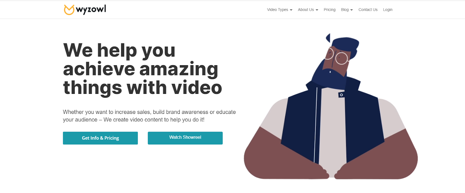
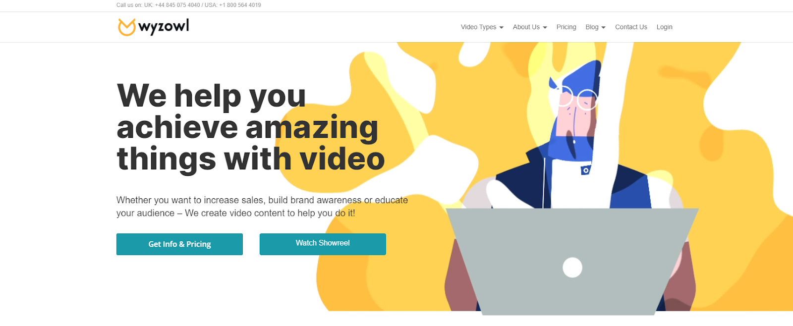
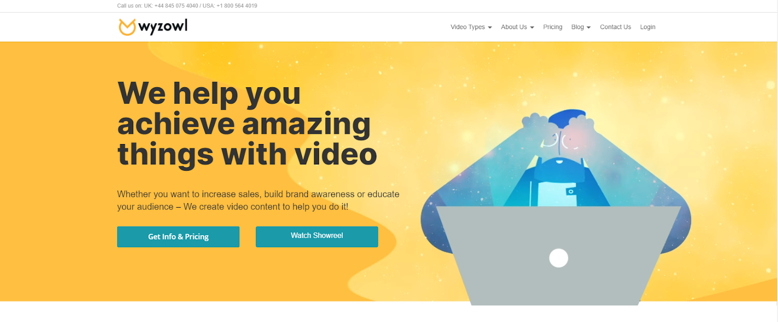
This is how Wyzowl does it:
9. Clear, recognizable icons
Every icon that’s part of your brand identity design should do what it’s supposed to do: provide a visual cue to facilitate effective communication minus words. Keep your focus on two qualities: simplicity and clarity.
10. Diverse imagery
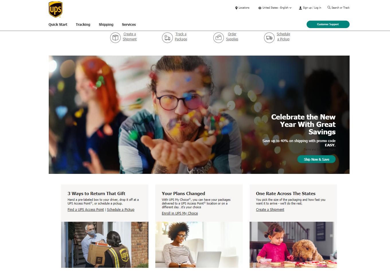
Having diverse images associated with your brand identity has more to do with representation. To successfully tick off this box, pay careful attention to the message conveyed by the imagery you use. What is it saying about your brand, your values, etc.?
This is where it pays to be sensitive of diversity (i.e., age, race, gender, and so on) in the images thay may become synonymous with your brand.

11. Neat, accurate data visualization
Big data has brands communicating more and more with data. This scenario has made data visualization a powerful tool for helping people grasp data—that is, provided that the data is accurately and clearly represented in charts, graphs, diagrams, tables, etc.
12. A concise, user-friendly brand style guide
Content creators and members of your design team may come and go, but your brand style should be set down in a proper, clearly written style guide. Unless it’s time to rebrand or pivot, there should be no deviations from established preferences and choices. Remember the value of consistency and cohesive brand experience.
Conclusion
Designing your brand identity takes thorough brand “self”-evaluation, comprehensive research, committed brainstorming, and likely a lot of trial-and-error problem-solving. All of it worth your and your team’s efforts. After all, the alternative is to end up with a brand identity that’s weak at best and incoherent at worst.
If you’re working on this aspect of your branding strategy, you deserve a motivated, talented team to work with you. At Purple Cow, we’re always ready to roll up our sleeves to help you with your digital marketing tasks.
Contact us today to learn more about our highly scalable, top-value digital marketing solutions.


