
Transforming visitors to your website into leads involves collecting their information. But even a single piece of personal information can be a challenge to acquire. People need proper convincing and a frictionless way to share their information. Find out what makes effective, high-converting lead-generation forms.
What Is a Lead-Generation Form?
It is a web form used by businesses to collect e-mails and other relevant information of potential customers visiting their website. Contact forms, registration forms, and basic newsletter signup forms are three of the most common lead generation forms.
Lead-generation forms are indispensable for building an e-mail list that you can, in turn, steadily build a client list from.
The Essentials of a Lead-Generation Form
Regardless of what your lead-generation form is intended for, the following elements deserve
your careful consideration to ensure your form yields the number and quality of leads that result
in significant growth for your business.
Placement
Your lead-generation forms can be placed above the fold or below the fold, in a sidebar or in a pop-up, or as a pop-up for a landing page.

Design
This involves a combination of placement and making your lead-generation form easy to distinguish from the rest of the content on a page, usually through the use of a different color and borders. This also includes your choices of images that appear in the form.
Copy
This involves determining how much text is necessary in the form and ensuring that it motivates your website visitors to give you their information.
Form fields
These require careful consideration in terms of alignment and order of questions, how much information to ask, validating the information provided, etc.
CTA
This is the call to action, which in a lead-generation form amplifies the significance and implications of your website visitor’s decision to give out their information: Do I really want to share my information?
How to Create Lead-Generation Forms That Convert
The email is often more than enough to give marketers a promising start to get prospects to buy a product or use a service. But in a lot of cases, more information may be required, depending on the brand and their specific offer around their product or service.
Whether you just need an e-mail or you need a bit more, make sure your lead-generation forms are optimized for conversion.
Here’s our 10-item checklist for ensuring high-converting lead-generation forms:
Mind your placement.
Convention dictates that your forms should be placed above the fold so it is the first thing people see, which makes perfect sense, and should be followed—if it makes practical sense for your brand. On closer look, placement actually depends on how ready your website visitors are to fill out your form.This question of readiness is influenced by the level of complexity of a brand’s value proposition. That is, not all value propositions can be easily grasped by a prospect—a fact that can be influenced by such factors as the following:
- Brand recognition
- Newness of a product or service
- Complexity of the concept behind a product or service.
A well-known brand with a well-known service, for example, will have an easier time getting website visitors’ information with an above-the-fold lead-generation form than a new brand with a relatively expensive new service. The former can use minimum copy above the fold, giving ample room for their lead-generation form.
The latter, on the other hand, will need more content, possibly even an explainer video to establish their service and justify the cost, before they can ask their website visitors for their information. Even recognized brands rolling out a new, latest-innovation product will need to craft copy that thoroughly describes the product and the emerging technology behind it. What this means is your lead-generation form will be below the fold, and your prospects won’t have to deal with it until they’ve been effectively convinced by your above-the-fold content.
In some cases, a new brand with a simple product whose benefits are immediately clear to its website visitors can place their lead-generation form above the fold without their prospects hesitating with unanswered questions.
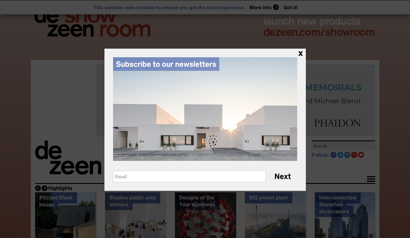
Avoid false bottoms.
False bottoms are created when your above-the-fold content ends exactly at the fold, without any visual signs to alert people that there’s more content below. If your lead-generation form is below the fold, all the more reason to avoid false bottoms. Use a directional cue—a simple clearly visible arrow or “Scroll for more”—to guide website visitors below the fold, and maybe another if your form is at the bottom of the page. Alternatively, you can make part of your content below the fold visible above the fold (as what Wix has done on their homepage).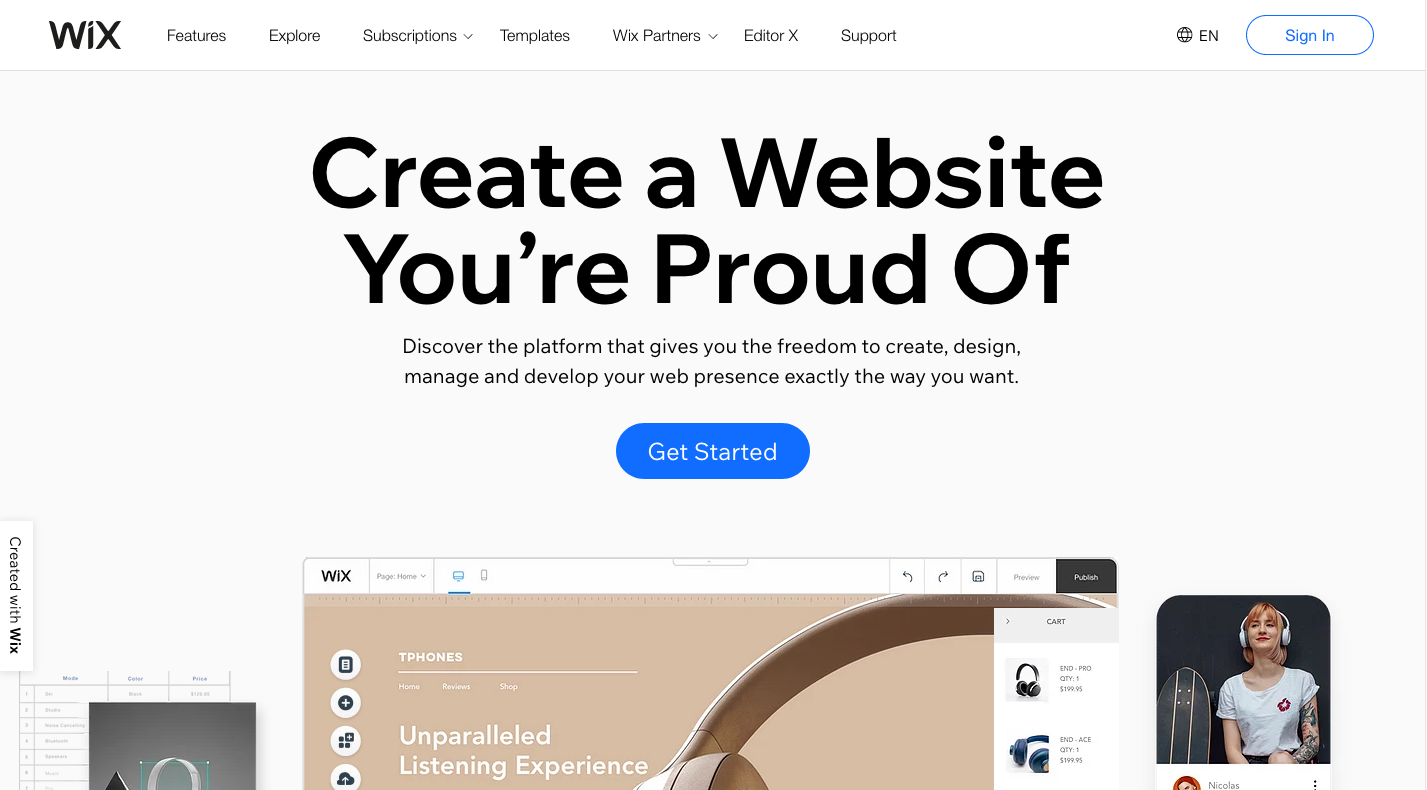
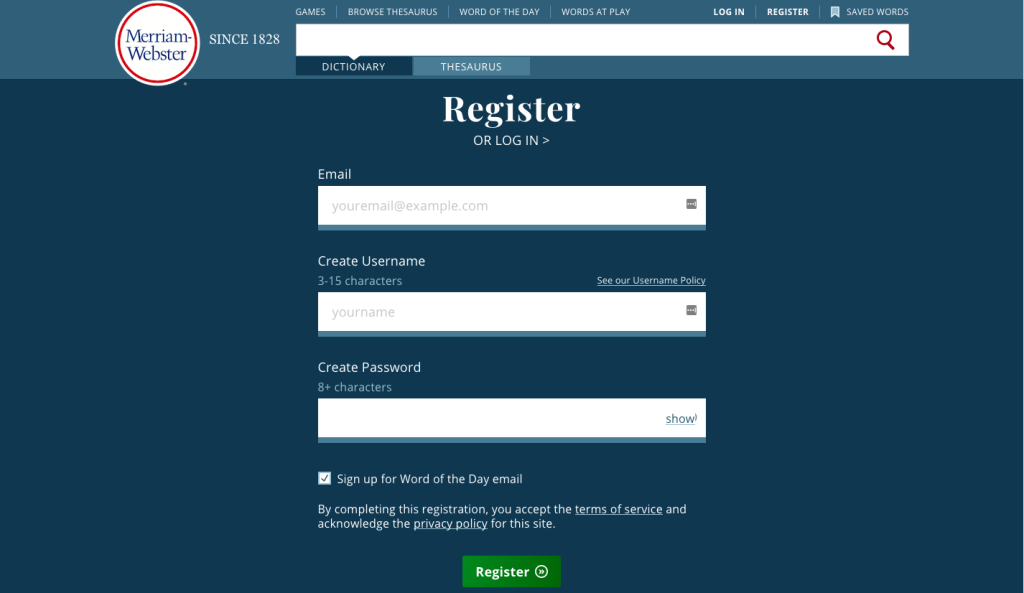
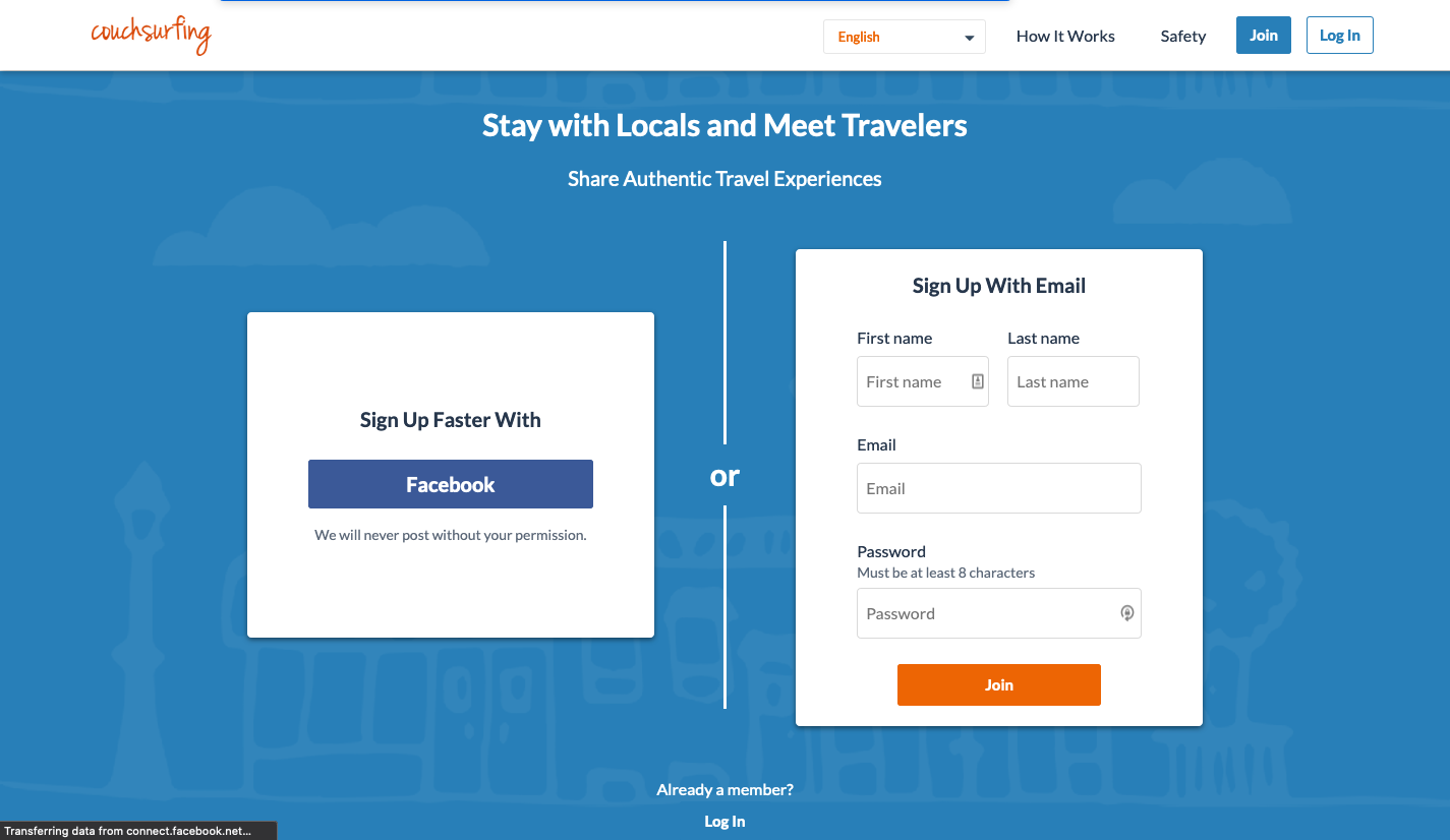
Put your form in a container.
Form encapsulation highlights the form and sets off from the rest of the content on the page. Effective encapsulation is achieved by thick or vivid-colored borders or a distinct background color for the form.

This DoorDash page is also a great example for the 3 tips follow.
Give your form a clear and concise title.
The title of your form should give your visitors a clear idea of what they will be receiving once they’ve provided the information you’re asking for.
Emphasize the value of your offer.
You can’t be coy if you want people to want your offer enough to give you their information for it. Offer them something useful, something that solves a real problem, something they want more of that you provide in your product or service.
Craft compelling content around and in your form.
Without content that convinces your visitors to fill out your lead-generation form, there is no conversion. Be sure your copy and the images used in your landing page, home page, as well as on the form itself are appropriate and accurately conveys the benefits of your product or service. They must also be consistent with your brand personality and voice.
Do away with unnecessary form fields.
Ask only for information that you need in order to provide your prospects the value you promise them. Determine whether you absolutely need any information in addition to e-mail. If you don’t, then an e-mail field is all you need.
Unless your prospect would expect, even want, you to call them, don’t ask for phone numbers. An Unbounce study found that forms with a phone number field saw a conversion rate dip of 5 percent on average.
If your offer (say, a steep discount) requires you to ask for more information (credit card information in this case), arrange your fields from easiest to fill out to the hardest. Name and e-mail are the easy ones. Once your prospects have filled out the first two or three fields, they’ll be more willing to take out their credit card and complete the form.
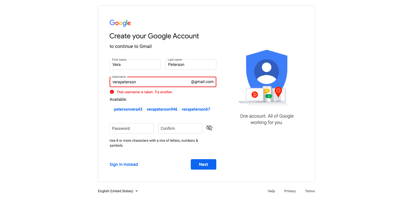
Validate form fields inline.
With inline form validation, a visitor’s information is reviewed in real time as they go from field to field. Any incorrect information (e.g., invalid email address or credit card number) will be flagged with an error message that pops up below or inside the form field, prompting the visitor to correct the error before they can move on to the next field.
Use pre-fill form fields.
Reward customers and yet-to-purchase prospects who are already in your e-mail list with zero-click form fillers, or progressive lead generation forms. These are an automation feature that enable marketers to further qualify repeat visitors by giving them an option as to which fields appear for a specific prospect, based on the information they’ve already provided.
Make sure your CTA is impossible to miss.
This is it. Make sure your CTA button stands out on the page:
- Use a CTA button color that looks striking against the dominant color of the page.
- Use a large-enough (but not oversized) text to make your CTA easy to read.
In addition, make sure that your call-to-action is brief and clear. It would be a horror if your visitor is just click away from conversion but then gets confused by your CTA. Use clear, strong verbs and be sure not to go beyond seven words.
Conclusion
Lead-generation forms—the effective ones, that is—are essential to the formula for inbound marketing success. Be sure yours are optimize for conversion: Remove friction by eliminating unnecessary and/or poorly formatted form fields, craft compelling content around and in the form, and make placement choices based on what’s best for your brand and your specific offer.
Boost your inbound marketing strategy with lead-generation forms that consistently help build your e-mail list, and keep your customers and prospects keep coming back.
Contact Purple Cow to find out how our highly scalable solutions can empower your business and help stand out in your industry.