As short as calls to action are, their impact on your success is anything but minor. They are an indispensable tool for any brand’s digital marketing team—for good reason. Find out why, and how to get the best performance out of your CTAs.
Contents
- What Is a Call to Action?
- Why Do You Need CTAs?
- How Do You Write Effective CTAs?
- Conclusion
What Is a Call to Action?
In marketing, a call to action is an invitation, a gentle nudge or a context-appropriate urging, a signpost along the sales funnel. It’s a marketing prompt for a response from users who visit a brand’s website and social channels. It doesn’t always say, “Buy now,” but its goal is always to help brands sell people their products, as well as sell people on something—ideas, values, a way of life.
Why Do You Need CTAs?
CTAs are a key element in any persuasive content—which is why you need them to sell your products or services. That is, sell them better, way better.
Without an effective CTA, for example, someone who is browsing through a page featuring your newest batch of cleverly designed handmade tote bags might ohh and ahh but then just move on to the next page (equally in need of a CTA) featuring another product. Sure, someone may really want those bags, in which case they will then have to take the long route to your store to make their purchase.
Even if people are looking to buy something or start using a service, they need to be nudged, especially if they don’t have a specific brand in mind or they think they’re still just looking.
CTAs are a staple in sales funnels. They determine how quickly buyers move from one phase of their buying journey to the next—if they do. Excellent CTAs ensure that they do, all the way through to the last phase.
How Do You Write Effective CTAs?
Tips abound on how to create the best CTAs. For this article, we picked the ten best practices you shouldn’t miss.
1. First things first: establish your goals.
Being clear on what you want to achieve translates into a focused, effective CTA. Your goals will likely include these:
- Lead generation
- Conversion
- More subscriptions
- Increased sales
- More eyeballs on and engagement around your content
Tailor every piece of CTA you write to your specific goal every time. Your focus and clarity focuses your audience too, which facilitates their decision to act.
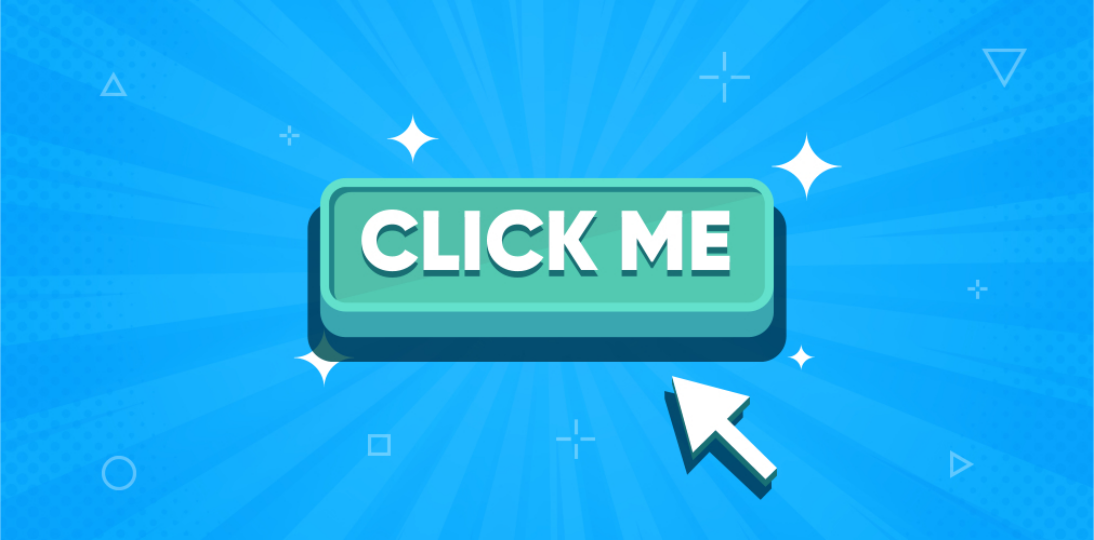
2. Keep it short.
Five to seven words ought to do it.
3. Prompt action with strong action verbs.
To get users to act, you need kinetic calls to action, and you achieve that with your choice of verbs.
They should be appropriate for your goal.
Free download in a lead-generating landing page
- Get your copy
- Get white paper
- Grab your free guide
Free-trial sign-up
- Sign me up / Sign up
- Get started
- Try it for free
Booking, reservation
- Book a seat
- Book an event / Book my event
- Reserve my slot
Purchase
- Add to cart
- Buy now / Shop now
They should be highly action-oriented.
The best action verbs include get, learn, discover, find out, shop, join, build, and start.

4. Harness the persuasive power of first person.
How many CTAs with first-person pronouns have you seen? If you think second-person pronouns are the rule for CTAs, think again.
We’re not saying use only first-person pronouns, of course. Rather, be alert to contexts where first-person CTAs would be the better option, and don’t miss the opportunity. What makes first-person pronouns a perfectly strategic option?
They make your CTAs feel more personalized.
A first-person pronoun raises the sense of intimacy and connection between the user and a product or service. Nothing wrong with “Find your new apartment,” but doesn’t “Find my new apartment” just give off more warmth?
For a while there, it made us think of apartment hunting with our best friend, locking arms with them and telling them, “Go ahead, you find me my next home before I end up on the streets because your apartment is ruled by your cats, who hate me.”
They give users a better sense of control.
A sense of control is easily tangible in a first-person CTA: “Schedule my consultation” can imply you checked your schedule and determined what time works for you before clicking the button. Clicking on “Tell me more” likely means it’s a convenient time for you, not to mention that you’re genuinely interested. First-person CTAs are especially effective with opt-in e-mails, where “Yes, send me regular updates” clearly implies, Yes, you may or You have my permission.

5. Work your value proposition into CTA related to your offers.
Use the CTA copy to emphasize your value proposition. For example, a free download of a basic-features version of your software tells your prospects that they get a certain degree of automation that makes their lives easier without having to pay for it. Remember, the word “free,” if nothing else, guarantees people will take a closer look, and sometimes a closer look is what makes the difference between a visitor leaving your website and a visitor ending up clicking on a CTA button.
6. Get your colors right.
The color of your CTA button is crucial, although, it turns out, not primarily in terms of which specific color performs better—despite the number of tests that pit green versus red with red emerging as the winner.
Rather than get too invested in the battle of CTA button colors, pay more attention instead to color hierarchy on your page, to how much a button color contrasts with the dominant color on the page. Sometimes determining your best CTA button color doesn’t take anything more than a no-nonsense squint test to see which color contrast is more appealing, or, even better, striking.
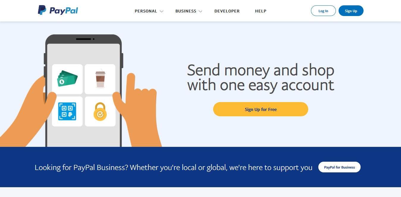
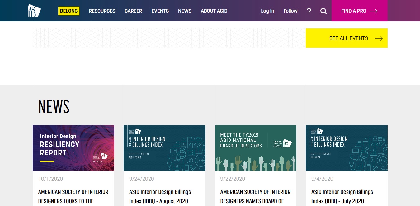
This is the CTA-button color situation over at the website of people who should know colors:
7. Ensure strategic button placement.
People who read and write in English read from the top down and from the left to right. Let this natural flow guide your button positioning decision. High-performing CTA buttons are typically placed toward the bottom or to the right of content.
Make sure your CTA buttons keep pace with a user’s reading/browsing. This is why a “Find out more” button appears right after a persuasive copy that highlights the best features of a particular service, product, event, etc.
8. Account for mobile responsiveness.
Whatever you do, don’t force users to backtrack to click a button, especially for mobile screens. To ensure CTA button visibility regardless of how far down, up, left the user has scrolled, use a floating call-to-action button or sticky CTAs.
9. Pick the right text size.
Reinforce an impossible-to-miss CTA button color with button text that’s large enough to be easy read. However, don’t go overboard with oversized text that will make your prospects feel as though you’re trying to intimidate them into action.

10. Use bonus text and click triggers.
Keep CTAs short and sweet, but know when additional text is helpful rather than distracting. This is usually the case with CTAs for free trial or limited-time offers, which often come with pertinent information like “Free for 30 days” or “Only $10.75 for the first three months.”
Also, it never hurts to give your visitor an additional encouraging or reassuring nudge. That’s why you need click triggers—copy that’s strategically placed near your CTA to help your visitors get past any bit of lingering doubt and convert.
The most effective click triggers include the following:
- Money-back guarantee
- Easy unsubscribe
- Cancel anytime
- No credit card needed
- Testimonial/recommendation from a satisfied or successful customer
- Slashed prices
- Privacy policy
Conclusion
Crafting consistently effective calls to action is among the digital marketing best practices you can’t afford not to adopt. CTAs play a crucial role in your brand’s growth and progress toward a commanding position in your industry.
Boost your sales through engaging content with calls to action that increase lead generation and conversion, and, ultimately, sales.
Contact Purple Cow to learn more about our easy-to-scale solutions designed to give you standout value that ensures you stand out from the competition.